AMAZON APPLICATION
Created in October 2021
Project duration: 4 weeks
Softwares used: Figma, Google Docs
Overview
Amazon is currently one of the most successful shopping platforms online, offering a large selection of products that include everything that comes to mind: electronics, books, beauty, home decor, cooking equipment, and so on. Users can choose to either visit Amazon on their website or download the application Amazon Shopping. However, despite its widespread use, I discovered that Amazon (more specifically the Amazon Shopping application) has lots of room for improvement in terms of the user experience. In this case study I determine what factors in the checkout process can be improved from the user’s perspective, and how they can be improved in the most effective way.
In this project I focus on usability issues and information architecture. Therefore, the graphic profile and design elements of the application were not changed in the redesign.
Please note: This project is not in any way a collaboration with Amazon, but completely fictional.
Research
Before redesigning the application it was important to conduct research on the topic. The research mainly consisted of three parts:
- Researching current opinions of the application.
- Determining target group and creating personas.
- Analyze functionalities of the shopping process.
Current Opinions
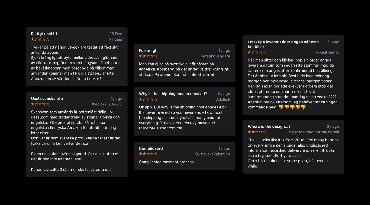
In order to investigate what users currently thought of the application, I turned to App Store, and the app reviews. Although many people was satisfied with the application, many users also expressed frustrations related to the functions and the user interface. Below is a sample of some critical reviews that was found and taken into consideration.
Target Group and Personas
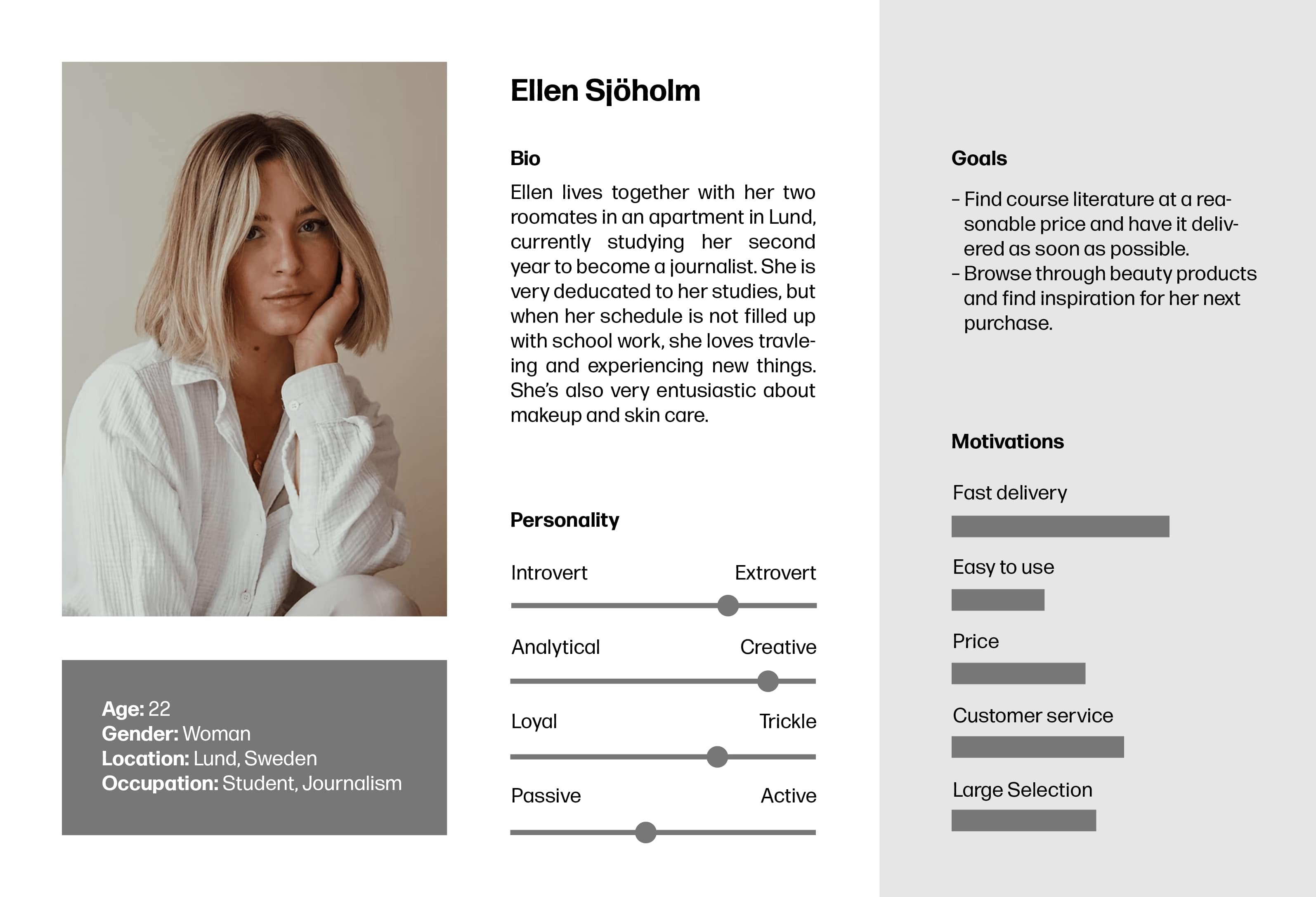
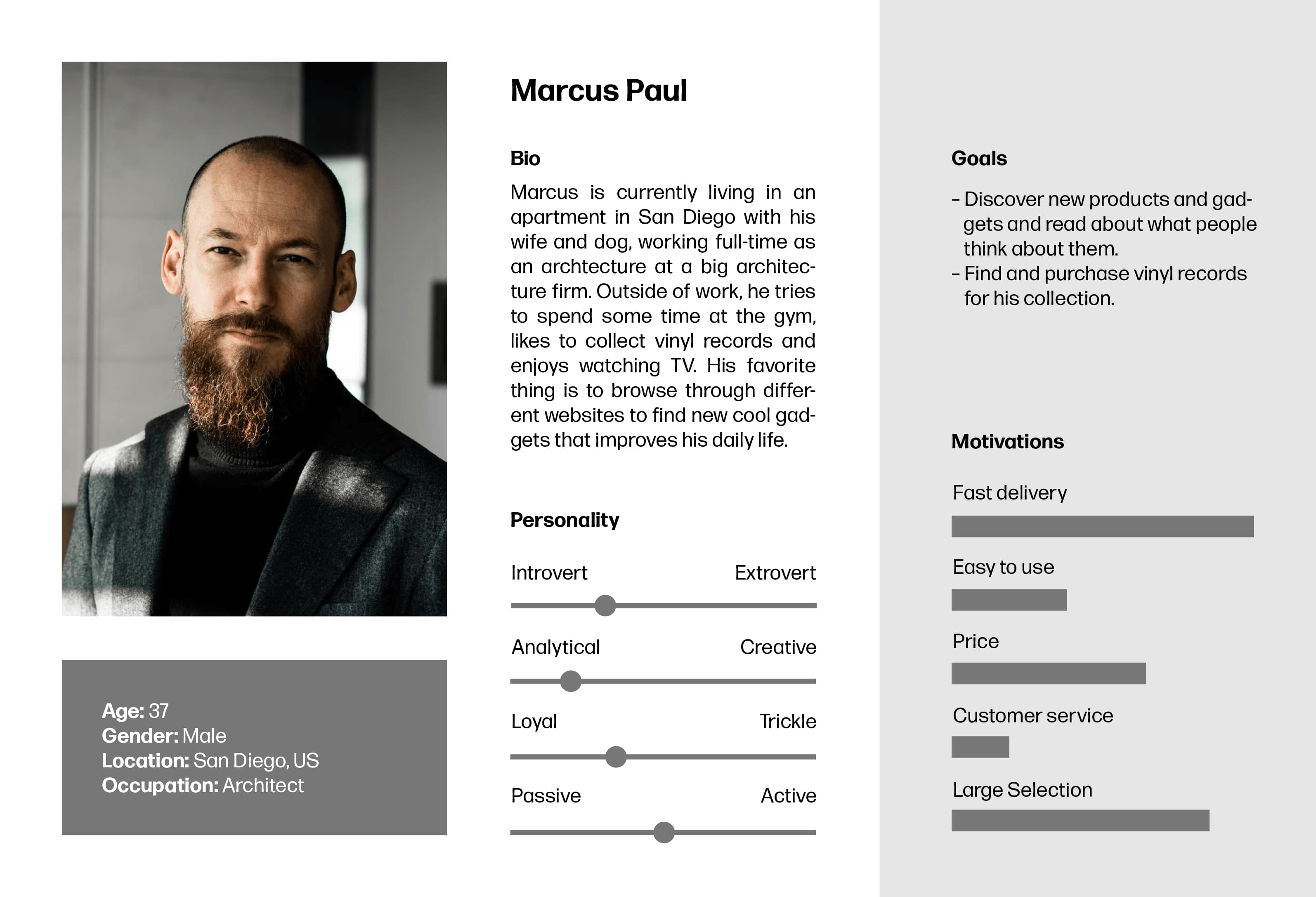
The target group of the Amazon Shopping application consists of people ages approximately 18-45, all genders. They own smart devices, have experience with using applications and have relatively good level of technological knowledge in general. The application is used by people all over the world, by both students and corporate employees, but originated in the United States, where it is most widely used.
From the target group, I crated two personas to best represent the typical users of the Amazon Shopping application:
Shopping Process Analysis
When it comes to the shopping process, meaning the complex process of ordering an item, there are some immediate usability flaws in the user interface. I took detailed notes of these flaws and had them in mind in the redesign process.
User Testing and Redesign
User testing was conducted in three rounds:
- Old application was tested prior to developing a prototype of a suggested redesign
- The prototype of the suggested redesign was tested.
- The prototype of the suggested redesign was tested again after implementing user feedback.
I conducted the three tests in the exact same way, with the same users, so that the results could be comparable. The tests began with a couple of questions to see if they have any previous experience with the app. The user was then given a task to place an order of a book and have it delivered to ICA Maxi Falköping, and they performed this task under observation. After completing the task, they were asked questions about their experience.
Old Process – Test Results
From the first user testing round, the following discoveries were made:
- It was difficult to know what parts that were mandatory to fill out to successfully complete the process.
- It was confusing that the address could be selected and/or changed so many times during the process.
- It was difficult to know how to properly navigate the address/delivery step.
- The last part of the process was messy and the information there was not well prioritized.
- It was difficult to know where in the process you were, meaning, it was difficult to know at what step the order would actually be placed.
- The shopping cart step (the first step of the process) and the payment method step were clear and easy to navigate.
New Process – Test Results (1)
During the second user testing round (testing the first draft of the redesigned process), the users said the following:
- The progress indicator that was added was a success as it helped keep track of where you were in the process.
- It was easy to change pick-up point during the address/delivery step.
- Good flow, much better structure of information than the old version.
- They would prefer a larger tapping area on some buttons.
New Process – Test Results (2)
This test round was completed to ensure that all necessary changes were implemented in the new prototype. The result showed that users were happy with the redesign.
Final Result
Shopping Cart – Redesign
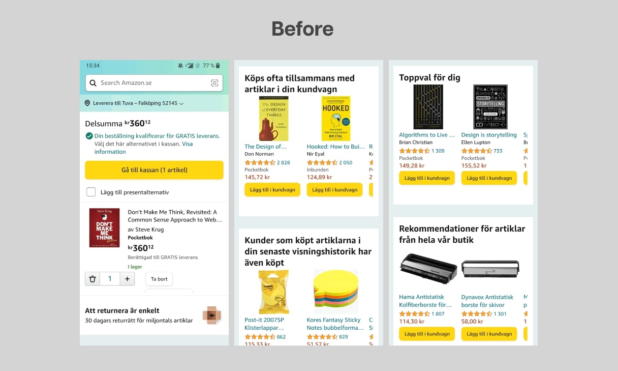
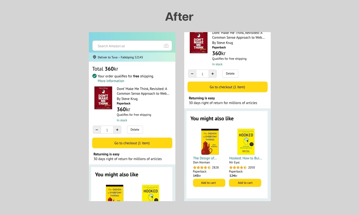
Even though this screen was understandable in the first place, it still had room for improvement. For example, the four categories of suggested articles are now combined into one single category called “You might also like”. As stated before, very few users will have the time, need and patience to scroll down and flip through every category of suggested products – they will most likely feel overwhelmed by the large amount of content. Now, when they won’t feel as overwhelmed, they might look through the suggestions, when they probably would just have skipped that in the original process.
Another thing that has been changed is that the gift options checkbox has been removed due to lack of information. It has instead been moved to the last page, where the user can easily choose to add gift options and read more about what it means.
Lastly, the “Go to checkout” button has now been lowered, which is necessary for the user to easily access the target.
Delivery – Redesign
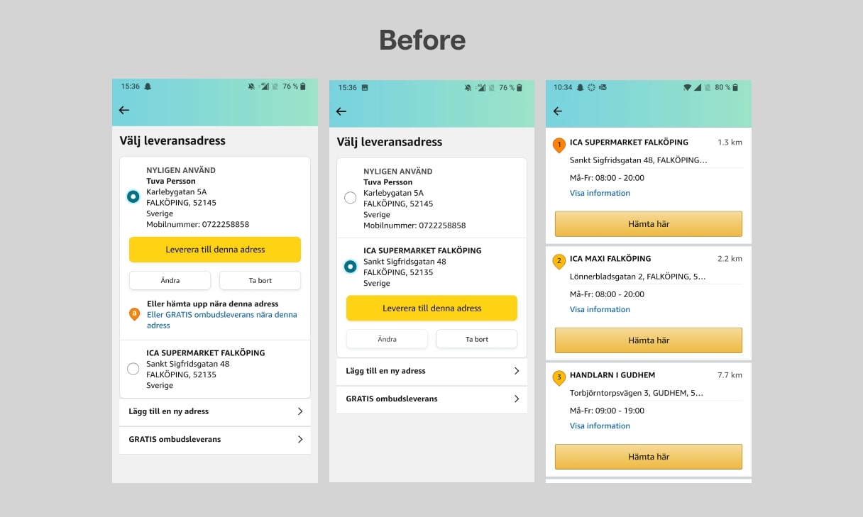
The "before" version of this step has three main problems.
- The type of selecting method that is used for selecting delivery address suggests that the user must choose between the personal address and the address of a pick-up point. In other words, if the user would prefer to have the parcel delivered to a pick-up point, they would deselect their personal address, which implies that their personal address no longer applies. However, the personal address should still be there as it operates as the invoice address as well as the address written out on the parcel. So, this type of selecting method is misleading for the user.
- If the user wants to have their parcel delivered to a pick-up point, there are three different buttons you can click to achieve that if your home address is selected: (1) “Or pick up near this address” (“Eller hämta upp nära denna adress”), (2) Suggested pick-up point, and (3) “FREE pick-up delivery” (”GRATIS ombudsleverans”). Having so many options to accomplish the same this is a huge problem, as the time of decision-making increases with the number of existing choices
- No delivery options together with prices are shown to the user. So, if the user selects for example their personal address as delivery address, does that mean the parcel will be home delivered? In that case, what’s the price of that? Or if they select pick-up delivery, what’s the price of that compared to home delivery? It simply leaves the user with many unanswered questions and causes high cognitive load which could lead to abandonment of the application.
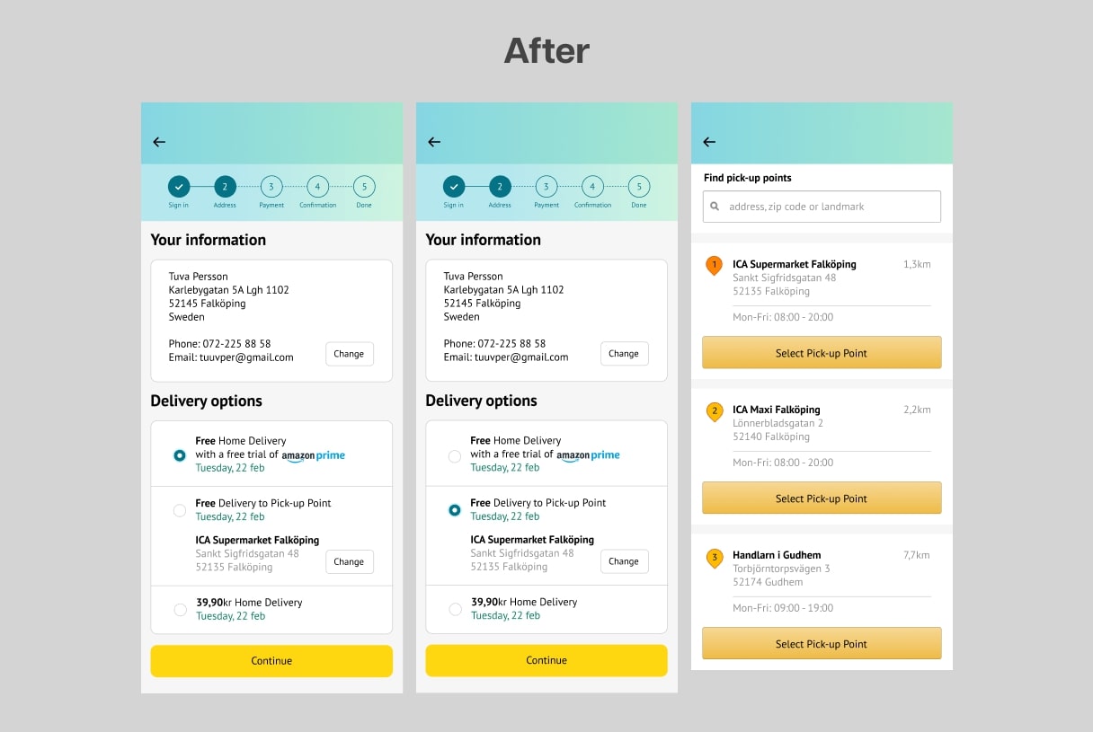
In the redesign, I adressed all of these issues. Instead of having only delivery address, there is now a section called “Your information”, because that is relevant no matter what delivery option the user selects. Also, there is now a section called “Delivery options” which in the original process can be selected only in the order overview. The user can now clearly see the delivery options available and the price of each option. The user can also easily change the pick-up point by tapping the “Change” button. They will then come to a screen where they can either search for a location or pick a close suggested pick-up point.
Another large improvement on this screen is an added progress indicator. This helps the users to know where they are, estimate how long the process will take and decide if they want to proceed or not – simply helps them navigate through the process.
Payment Method – Redesign
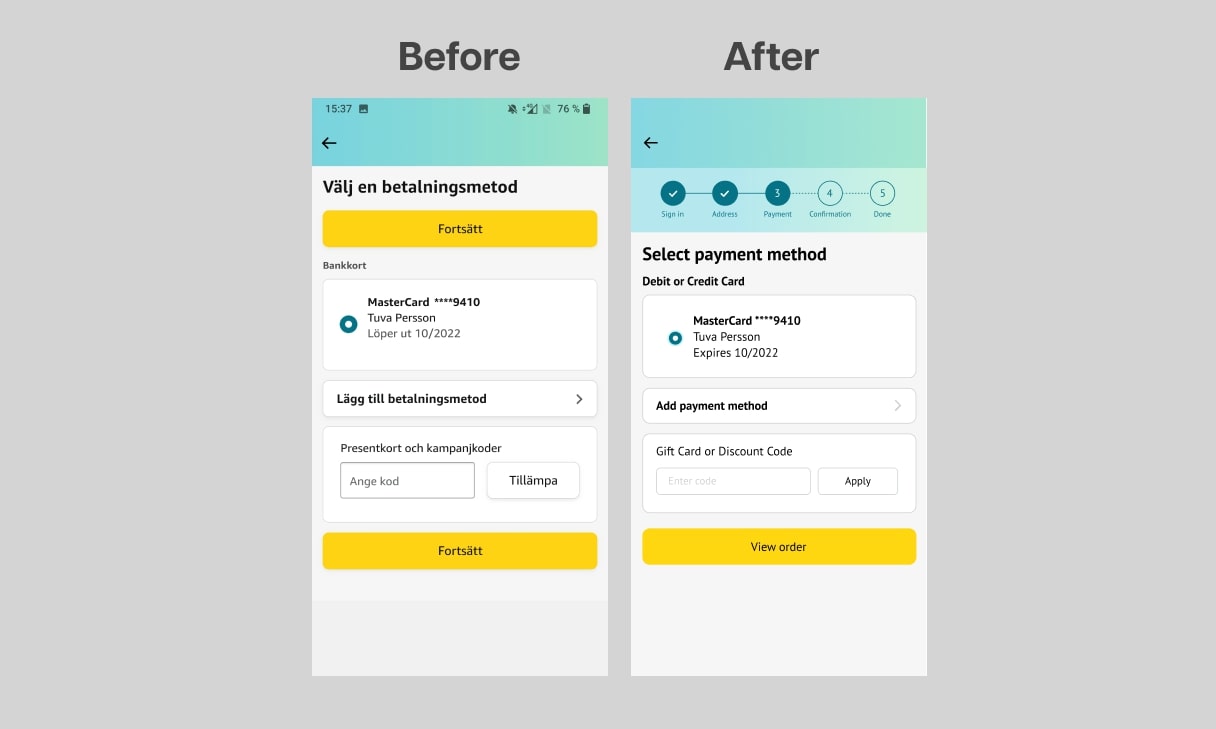
Since this step worked well in the original process, there was no need for major changes. The only things that changed are the addition of the progress indicator and the removal of the top “continue” button as there’s no need for a second button in such a short screen.
Order Overview – Redesign
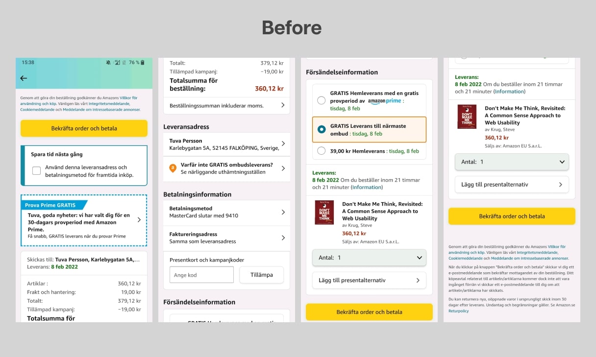
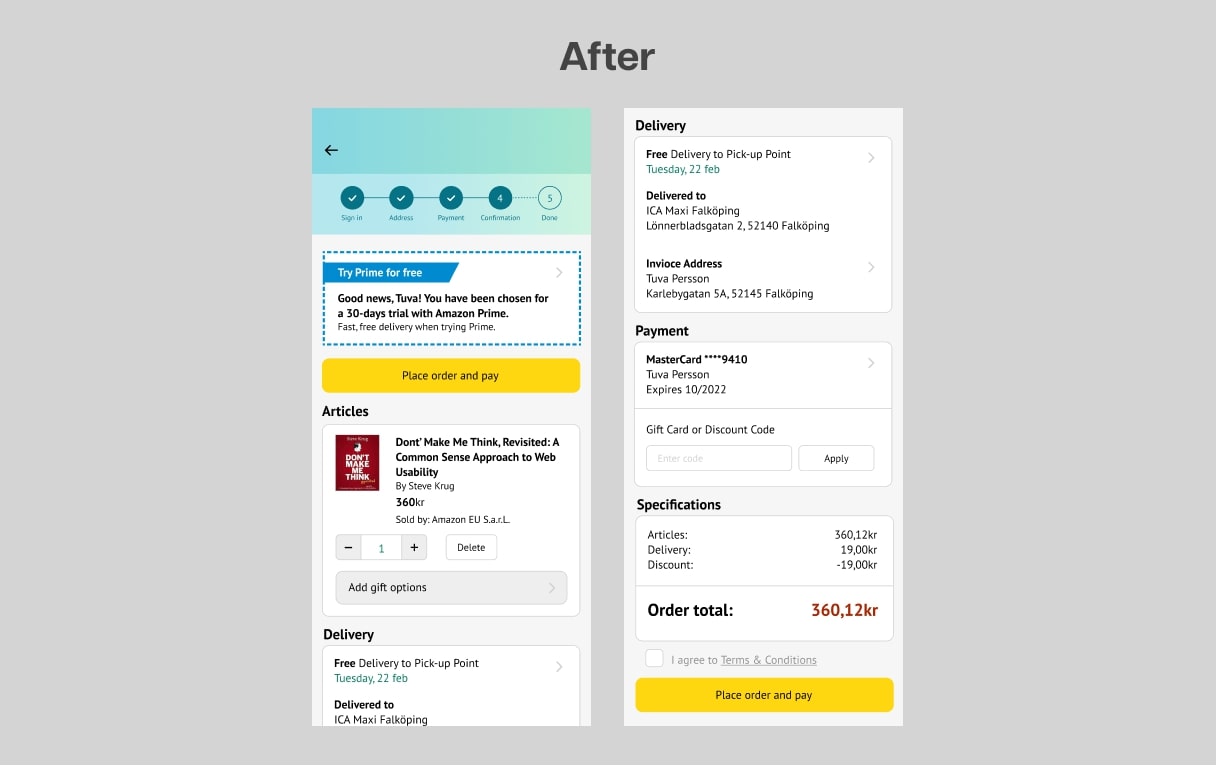
The things that were changed in this part of the process are:
- Articles overview and order total switched places. That’s the most usual way to structure it, and the user can then user their previous knowledge to navigate through the screen.
- The delivery options were moved to the address screen, as explained before.
- Better prioritization of information and easier to see what’s needed.
This step was not necessarily difficult to understand, but the information could be organized so that the user won’t have to think too much.
Thank You!